Have you ever looked at a family tree and seen how everyone is connected—parents, grandparents, siblings, and cousins all mapped out in boxes and lines? An organisation chart works the same way, but for a company instead of a family. It shows who works where, who reports to whom, and how different parts of the business fit together. While you could draw these charts by hand or use basic tools,
organizational charting software makes creating and managing these diagrams much easier and more useful. Let’s explore what organisation charts are and why using proper software to create them makes such a big difference.
Understanding Organisation Charts
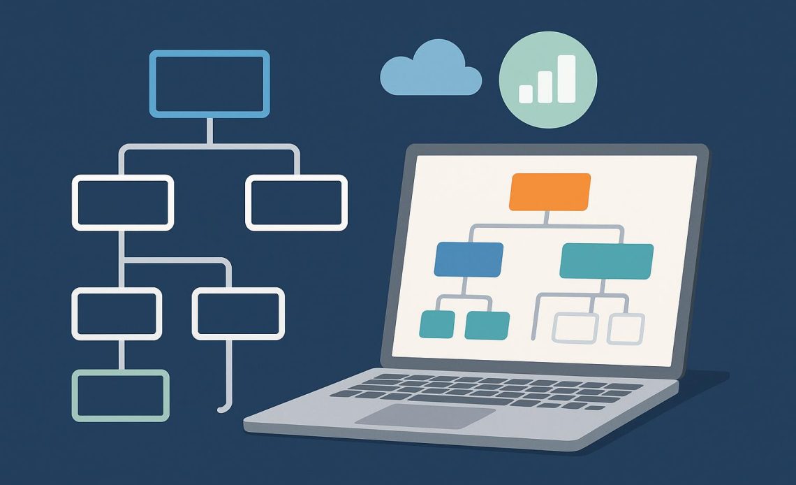
An organisation chart, sometimes called an org chart, is a visual diagram that displays a company’s structure. It typically shows employees as boxes or circles with their names and job titles inside. Lines connect these boxes to show reporting relationships—who is someone’s boss, who works on the same team, and how different departments relate to each other.
At the top, you usually find the CEO or president. Below them are senior executives like vice presidents or department heads. Then come managers, supervisors, and individual team members. The chart might be arranged vertically like a pyramid, horizontally across the page, or in other creative layouts depending on the company’s structure.
Why Organisation Charts Matter
These charts serve several important purposes. They help new employees understand how the company is organized and who to contact for different issues. They clarify reporting relationships so everyone knows their direct supervisor and chain of command. They also reveal the overall structure at a glance, showing which departments exist and how they connect.
For managers and executives, org charts help with planning. They can spot gaps where positions need to be filled, identify departments that might be too large or too small, and visualize how reorganizations might work before making changes.
The Problem with Manual Charts
Some companies still create org charts using presentation software, drawing programs, or even paper and pen. While this can work for very small businesses, it quickly becomes a nightmare as companies grow.
Manual charts get outdated almost immediately. Someone gets promoted, a new person is hired, or an employee leaves—and suddenly the chart is wrong. Updating it means finding the file, making changes, and redistributing it to everyone. Most companies give up and end up with org charts that are months or years out of date, making them useless.
Manual charts also take a long time to create, especially for large organizations. Drawing hundreds of boxes, connecting them with lines, and arranging everything so it looks nice can take days of work.
How Organizational Charting Software Helps
Automatic Updates
The biggest advantage of using software is that it can update automatically. When someone’s job title changes in your HR system or employee database, the org chart reflects that change instantly. No one has to remember to manually update a diagram. The chart always shows current, accurate information.
Easy Creation
Instead of drawing boxes and lines yourself, the software generates the chart automatically from your employee data. You just import the information, and the software creates a professional-looking diagram in seconds.
Interactive Features
Digital org charts can be interactive in ways paper charts never could be. Click on someone’s box to see their full profile, contact information, or photo. Search for specific people or departments. Filter the view to show only certain teams or locations. These features make the chart much more useful than a static picture.
Multiple Views
Different people need to see the organisation in different ways. Executives might want a high-level overview showing just departments. HR might need detailed views with every employee. Managers might want to see just their team. Good software lets you create multiple views from the same data without maintaining separate charts.
Scalability
Whether your company has fifty employees or five thousand, the software handles it smoothly. As you grow, the chart grows with you automatically. You’re not stuck redrawing everything when you hire twenty new people.
Access Control
Some employee information might be sensitive. Software lets you control who can see what. Everyone might see the basic structure, but only HR sees salary information or employment dates.
Integration with Other Tools
Modern organizational charting software connects with your existing systems—HR databases, Active Directory, or employee directories. This means you maintain information in one place, and it flows automatically to the org chart.
Professional Appearance
The software creates clean, professional-looking charts every time. No more crooked lines, misaligned boxes, or charts that look like they were drawn by hand. Everything is neat, organized, and easy to read.
Making the Right Choice
Understanding
what is an organisation chart and recognizing its value is the first step. The second step is choosing the right tools to create and maintain these charts effectively. Organizational charting software transforms what used to be a tedious, time-consuming task into an automated, always-current resource that helps everyone in the company understand how the organisation works and where they fit in.